Tree – Icons, Search, Styling
Inside the Tree tab are several options to add features or control styling.
Adding an Icon
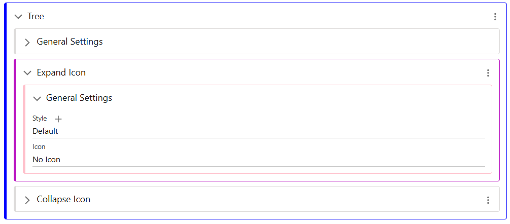
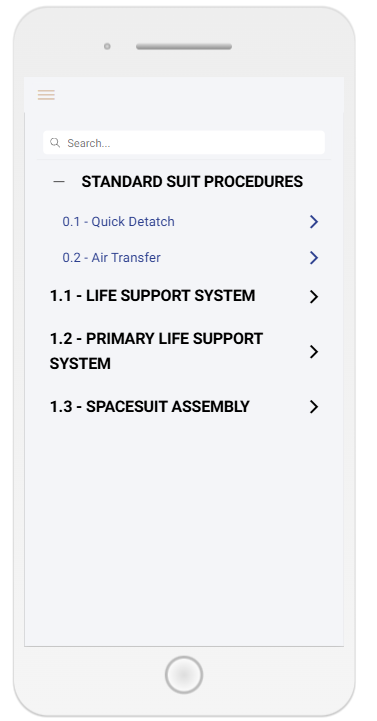
Icons appear in several places in the Tree screen. There is an Expand/Collapse icon, for the Sections in your Book, and there is also an Article icon which can be added if required.
Edit the selected Icon, and choose from the list of Icons available. If there is not the icon you require in this list, it may need to be added using the guide here.
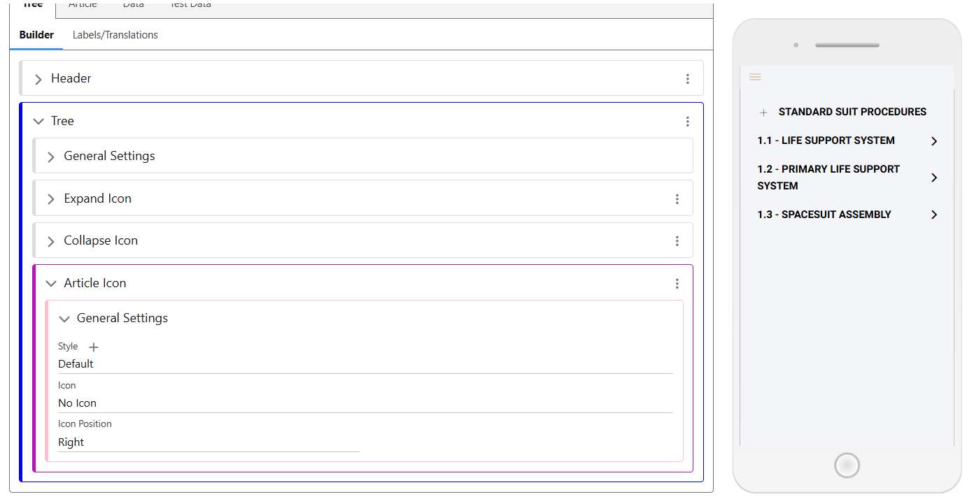
If an article icon is added, you can select its position as Right or Left. As seen in the screenshot below, the ‘Standard Suit Procedures’ section has a ‘+’ icon to expand it and show the articles below. The 1.1-1.3 sections are articles, and therefore the directional arrow is shown.
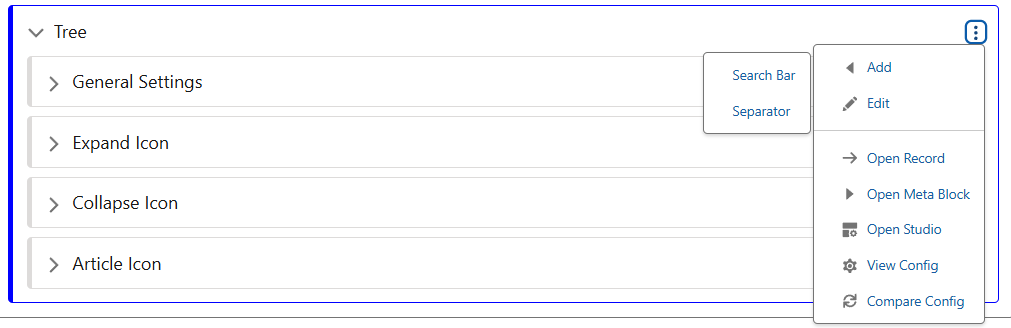
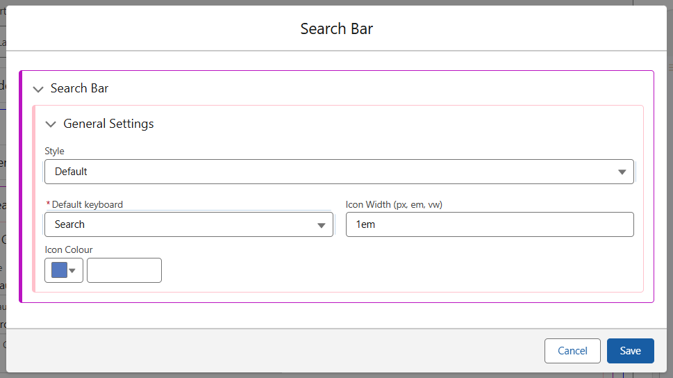
Search Bar
Using the Add menu in the Tree, a Search bar can be added to a Book.
The config of the Search Bar allows for a styling class. This class can add a background colour or padding to the Bar, a default keyboard setting to switch between Text and Number as required, and an option to control the Icon colour/width.
Tree Styling
The Tree Style has the following sections. Component and Wrapper allow you to style the container of the Tree, providing borders, margins/padding and background colour options.
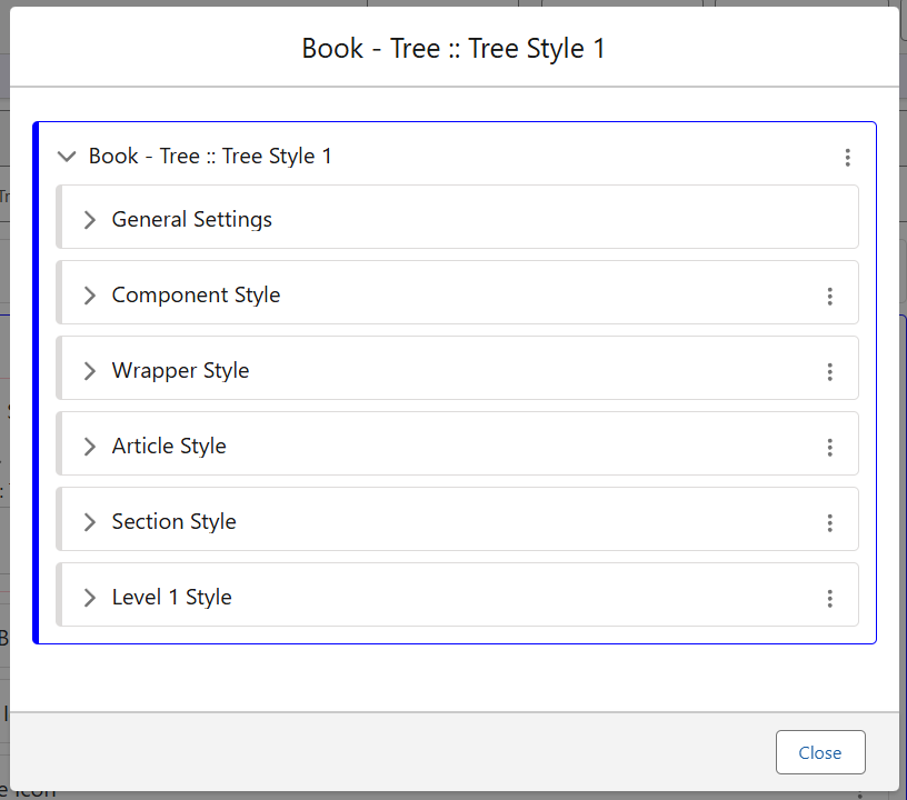
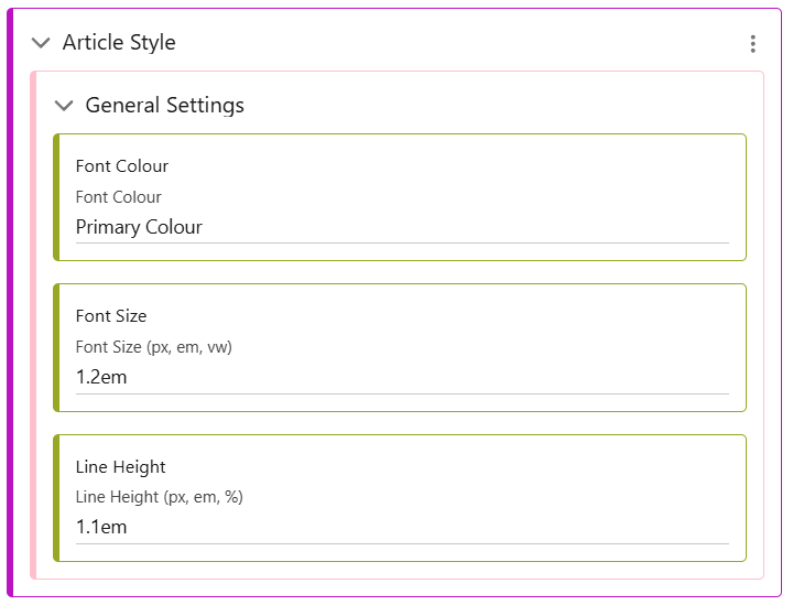
Article, Section and Level 1 style all control the various levels within the Book.
As seen in the screenshot above, the Article and Level 1 styles have been configured, while the Section Style has not.