In this article
Text Components
When using Text in an application, its functions depend on where it is used. In the example below, free-form text has been added to a Standard Page. Here, there are 3 levels of applicable styling.
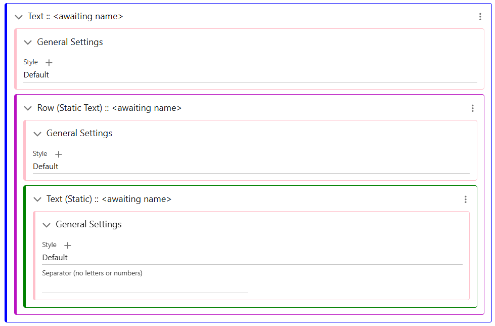
The high level contains the Text Rows, which may be multiple depending on the requirements. As seen below, you can set the Component/Wrapper Styles that contains the entirety of your text.
Text Rows are the next level of organisation. Depending on which screen type this text is in, there will be different options for the types of Text available to add to Rows. In screens which display pieces of data, such as Lists/Content Screens, fields can be directly displayed as text. By using the Add menu of the Text Row, you can add as many pieces of text as possible.
All Text in a Row can be styled by the Text Row General Settings Class, as it is cascading, but each can also be overwritten individually by adding its own style class in the Text (Static) element. Row styling can also provide padding and margins within the Text Component/Wrapper.
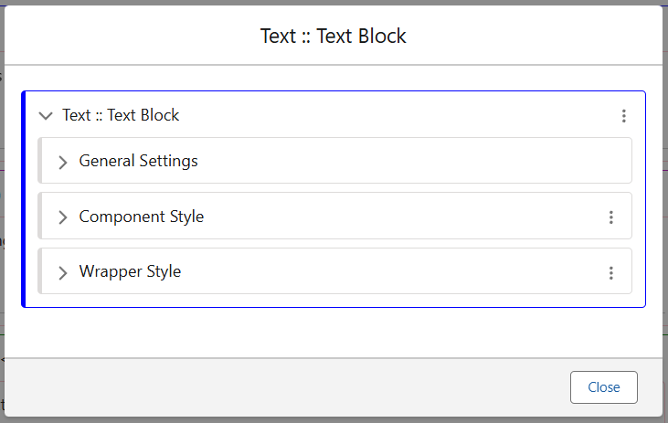
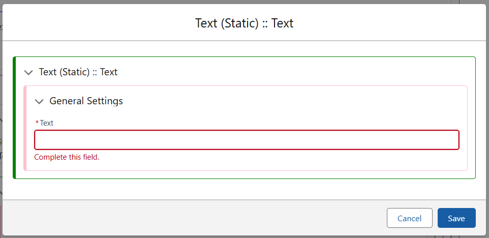
The final level, Text (Static) is where the freeform text is added. Using the ‘Edit Translation’ option in the Text (Static) menu will provide the following box, simply add your desired text here and save.
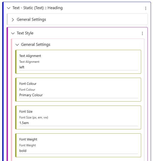
To format this text, here is a brief example of some styling added to the ‘Heading’ class.