In this article
Styling the Button Grid
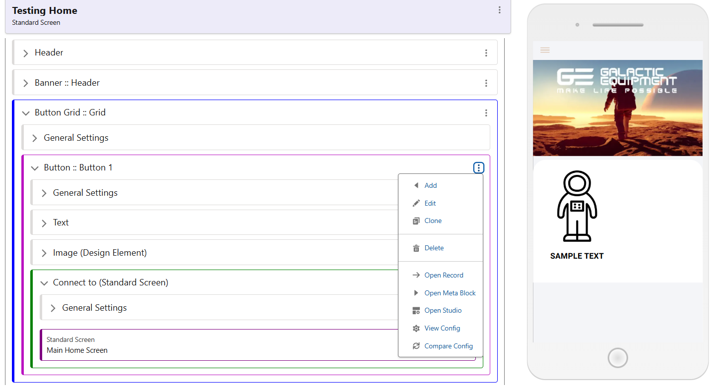
Once a button is configured, edit its high level Component, give it a name, and select a Style from the list. Preconfigured are styles for 1, 2 or 3 column grids. Choose one of these, and hit save. Edit your Button Grid Component, and repeat the process as before. Choose a name, then select the Style that accompanies your chosen number of columns. Finally, add this number in the Number of Columns section, then save.
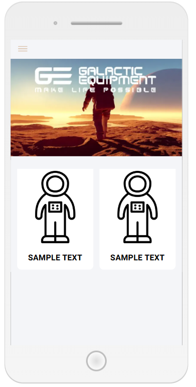
As this grid is configured to be 2 columns, and we have only one button, a second button will be created by cloning the first one.
The final result should look like the screenshot seen below. Although these are very basic styling classes, there is a lot of room for customisation. Button Grids can be styled at several levels, for the Grid itself, for each individual button, as well as images and text elements.