Creating a Style Guide
A Style Guide provides a default set of styling applied throughout your Book, without having to set a class for each element. To create a Style Guide, first navigate to the ‘Themes’ tab of the Composer. Click ‘Add’ and scroll down until you find the Page style.
Once created, this will serve as the new shell for your Style Guide. Inside this you can create the following style elements.
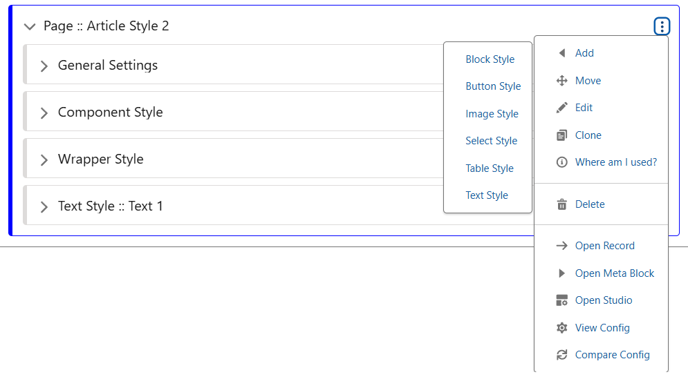
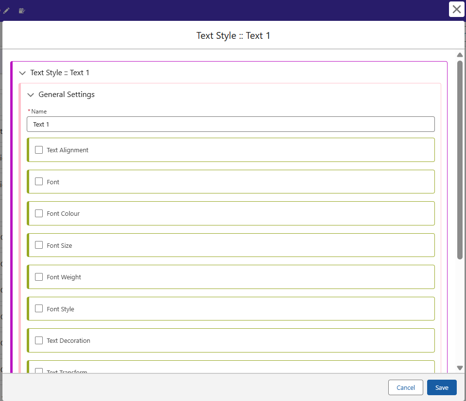
You can create up to 20 styles for each Block, Image or Text style. When creating elements, each must be assigned to a numerical value. Make sure you record/remember which Style corresponds to which, as we will give them labels later on in our Style Guide.
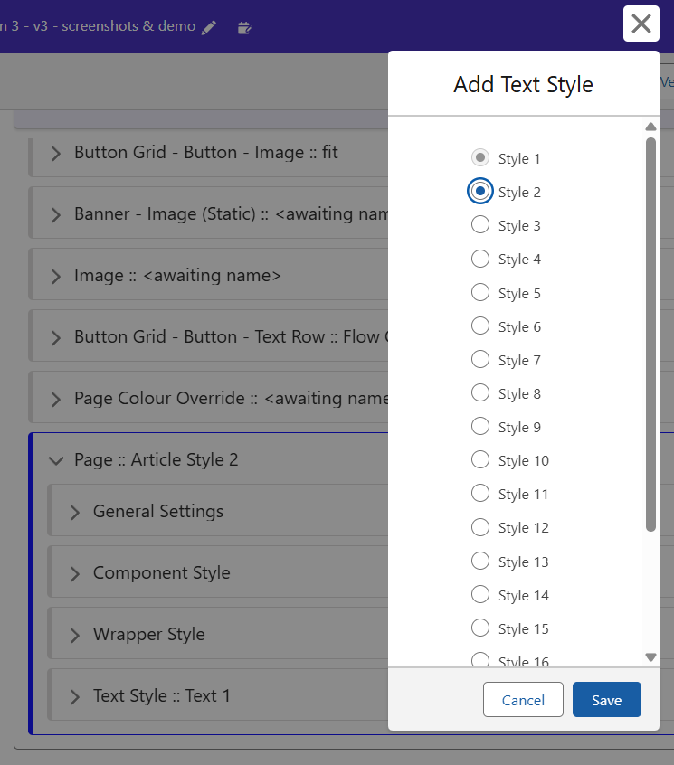
Create a new Text Style, edit the new Stub, and the menu will appear as follows. Each of these elements can be changed to style your text exactly how you want. In many cases, creating a Text Style for Heading 1, Heading 2 and Heading 3, as well as similar options for Body Text is advisable. Block Styling can then be used to create a container around the text, where in some cases you may want text to occupy the full width of the screen, or to only utilise half.
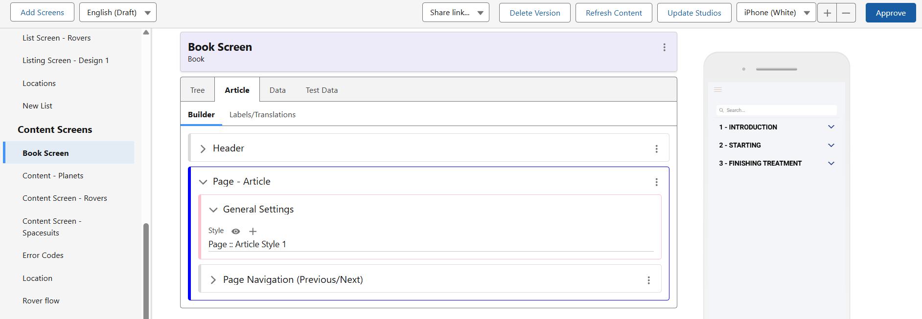
Once you have created some text and block styles, return to the Screen in which your Book is displayed, and open the Article section. Under the Page – Article block, you can now switch out the Style for your newly created Article Style 2. Now these have been swapped out, let’s finish setting up the defaults in the guide so they can be selected quickly.
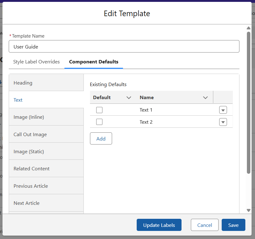
Component Defaults
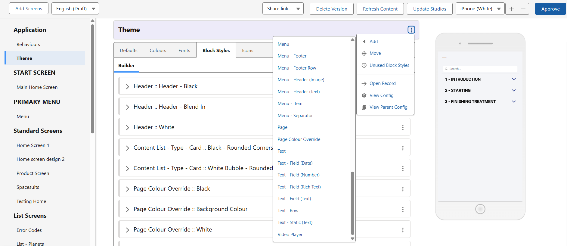
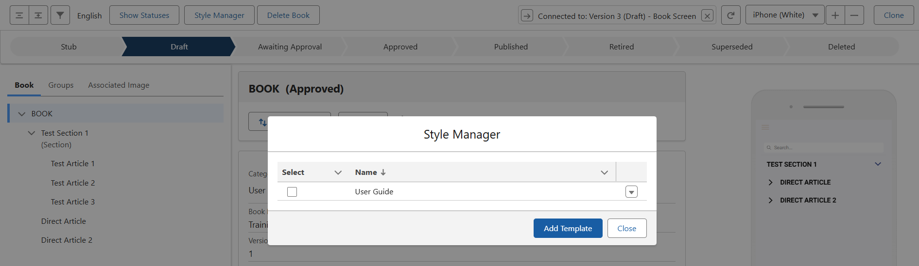
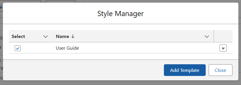
Back in the Book Editor, click the Style Manager button and you will see the following. The User Guide is part of the template application, so we will use the Add Template function to create a new one for our new Style Guide. For this demo, we will use the already existing Defaults as examples, which you can replicate or alter however suits.
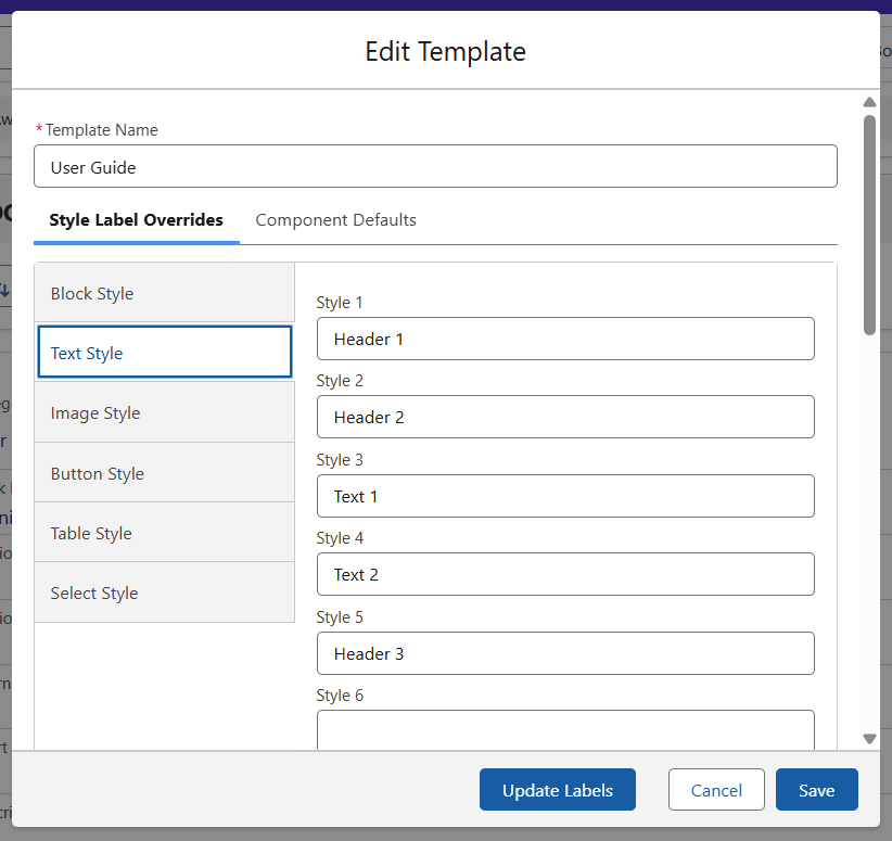
As mentioned earlier, each Text Style you create in your Theme block is assigned a number (1-20 depending on whichever you selected). Here, in the Text Style section, you can see the label assigned to each of these styles. This is the same in the Block Styles section here too.
Over in our Component Defaults tab, you can see that there are two pre-existing defaults for Text. Let’s go ahead and create a new style.
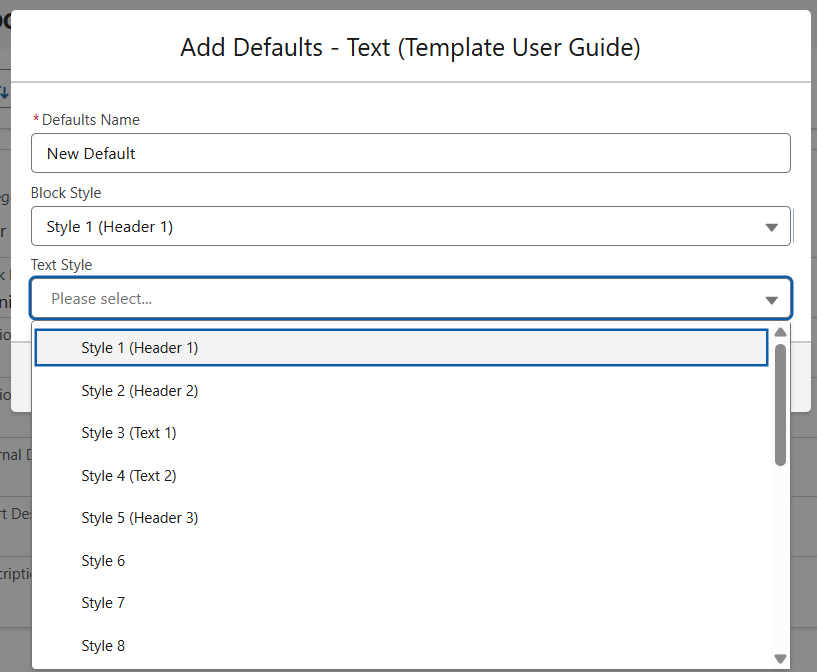
After hitting the ‘Add’ button, you will see the following menu. Name your new default, here I am creating a style for Header text by selecting the Block and Text styles I have created and labelled for this purpose.
Activating and Using your Style Guide
Once you are finished setting up your guide, return to the Style Manager and select it from the menu. Now, your Book will inherit its styling from here, and automatically update should you make any changes to a class.
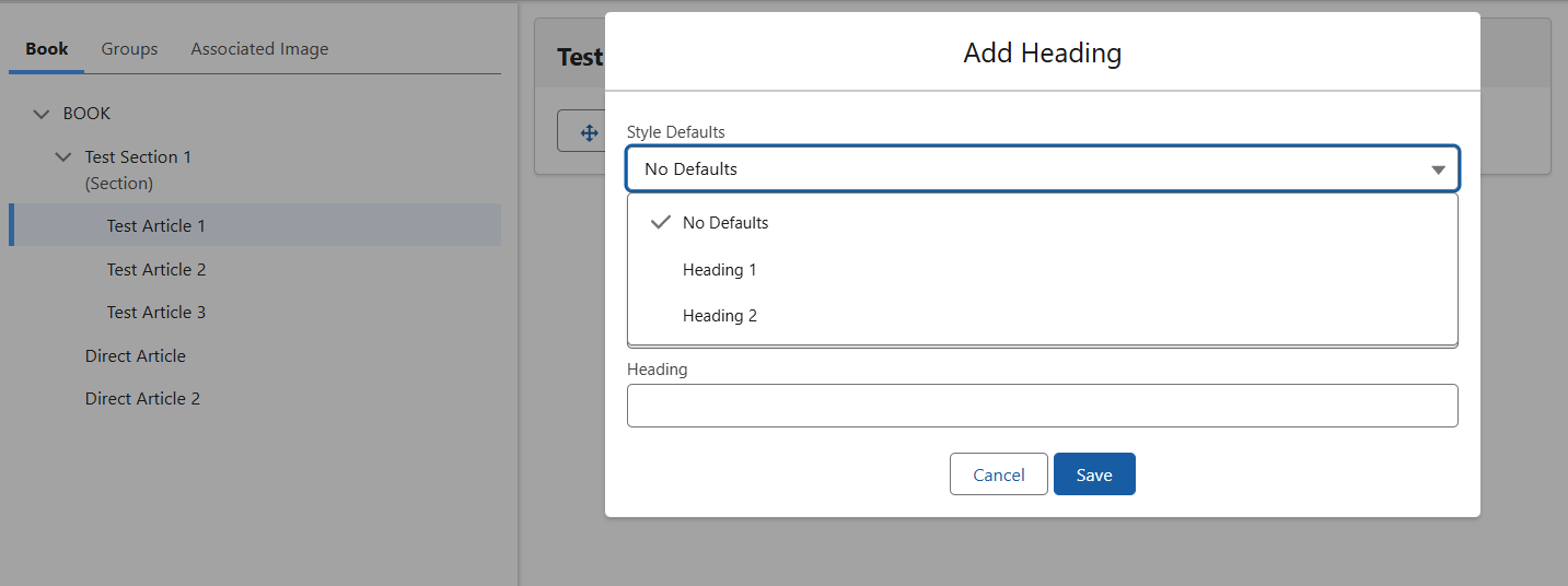
When creating a new element, you will now be able to access the default options set up earlier. Here, when adding a Heading, I have the two options from my default User Guide to select from. The same is true of text or image elements.