Configuring the List Component
Inside the List Component, there are the following options for configuration. This page will run briefly through the options of each.
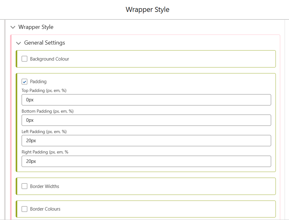
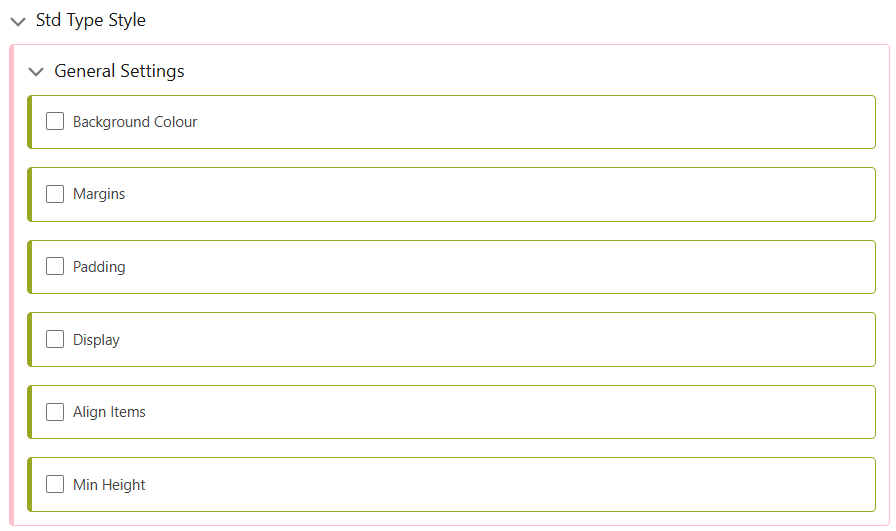
General Settings
The General Settings style component controls the Component itself, NOT the items in the list. Seen below, the Wrapper Style provides Padding around the List Component.
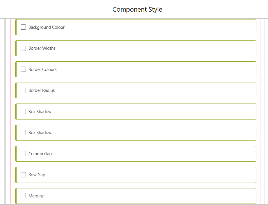
The options available in the Component Style are the following.
List Type
Lists can be two types, Standard, or Card. Using a Card enables borders and styling options not otherwise available, as well as being able to use multiple columns in the list. The screenshot below shows the options available in the Standard list, while Card has extra options for Box Shadows and Border Widths/Colours.
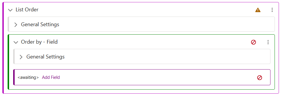
List Order
This section allows you to choose a standard or custom field by which your list will be ordered. There is support for ordering by Custom Date, Number, Rich Text, or Text fields, or by the standard fields provided. To view a guide for adding custom fields to a Category, navigate here.
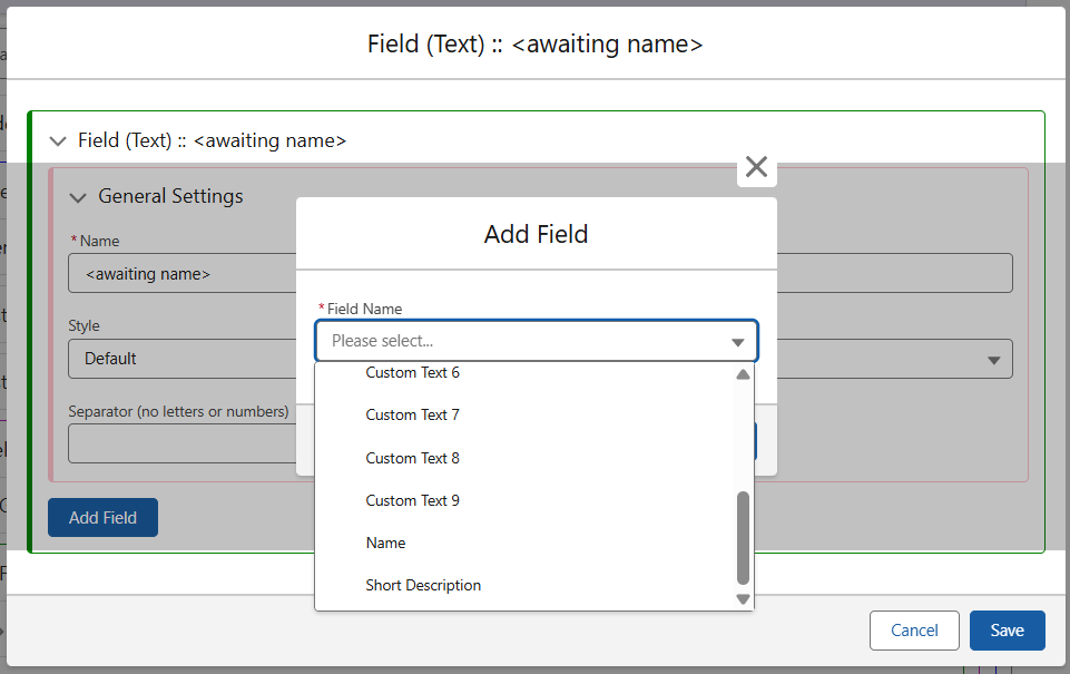
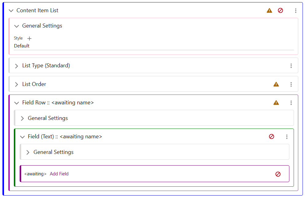
Field Row
Field Row controls which fields from your Collection Items are pulled through to the List. Often, the first field selected will be the Name of the Item.
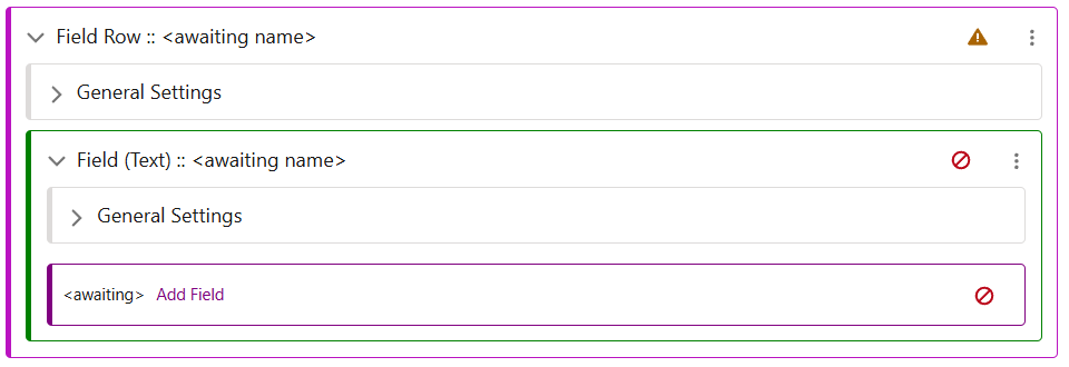
When selecting the field, you can select any of the Custom or Standard fields, as well as providing a Text Style. When configuring this screen, select the required field and either create or give it a style. For a guide to styling Text, click here.