In this article
Button Grids
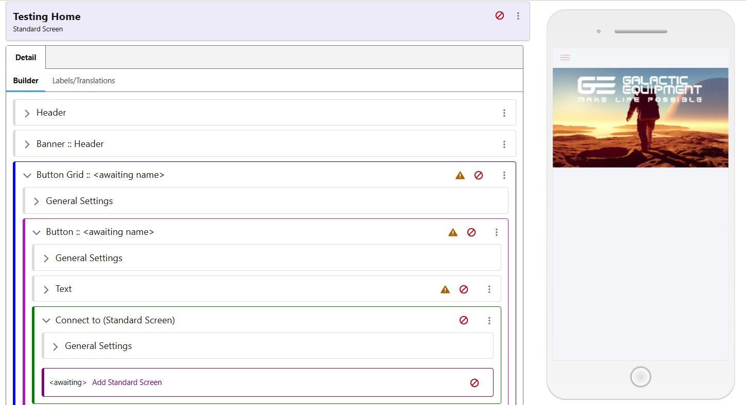
Button Grids are excellent tools for navigation, allowing a screen to point to as many different pieces of content, lists, books, or other screens as required. Button Grids are available on Standard Pages and certain types of Content Pages. To create one, use the ‘Add’ in the Screen menu, and your page will look like the screenshot below.
Adding Images to Buttons
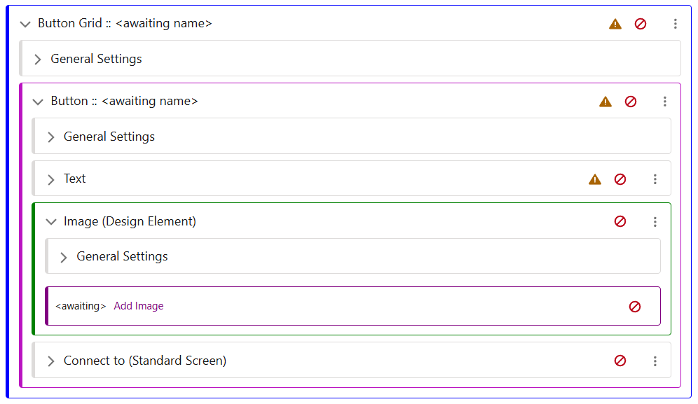
In the button, use its ‘Add’ menu to select a Design Element. Once this has been created, use its menu to swap it to an Image from an Icon. This will allow you to add an image via the media explorer.
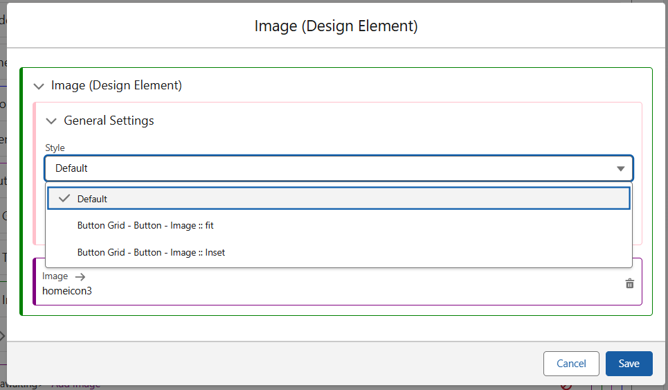
When selecting the image, there are also Style Classes available for the image. As seen below, these can control whether or not the image is expanded to full size, or has margins/padding as appropriate.
Button Text
Next, edit the Text Row component, and choose the default Style called Button Text for now. Edit and save the high level Text component to clear its protection.
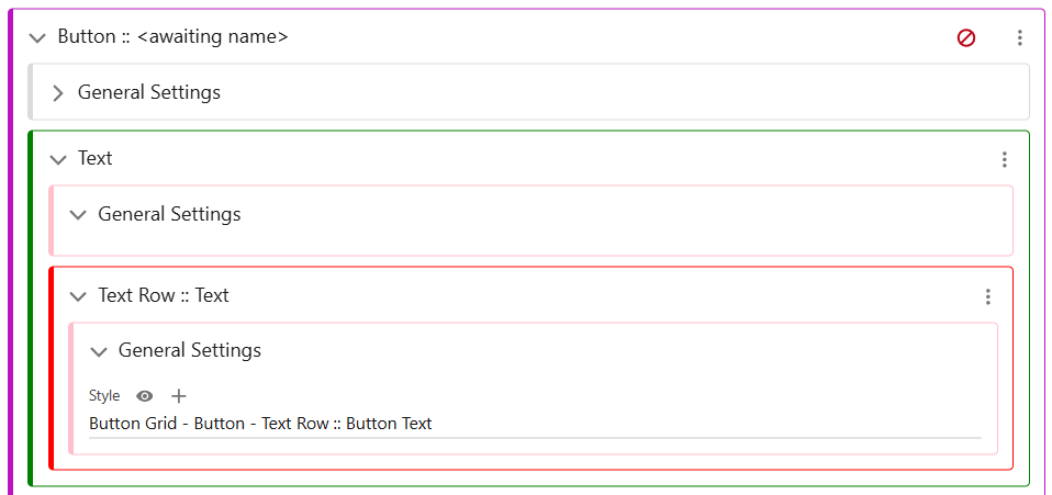
To change the Text displayed in the button, use the Edit Translation option from the Text Row: Text menu, and input your required text.