App Header Styling
Using an Image or Text
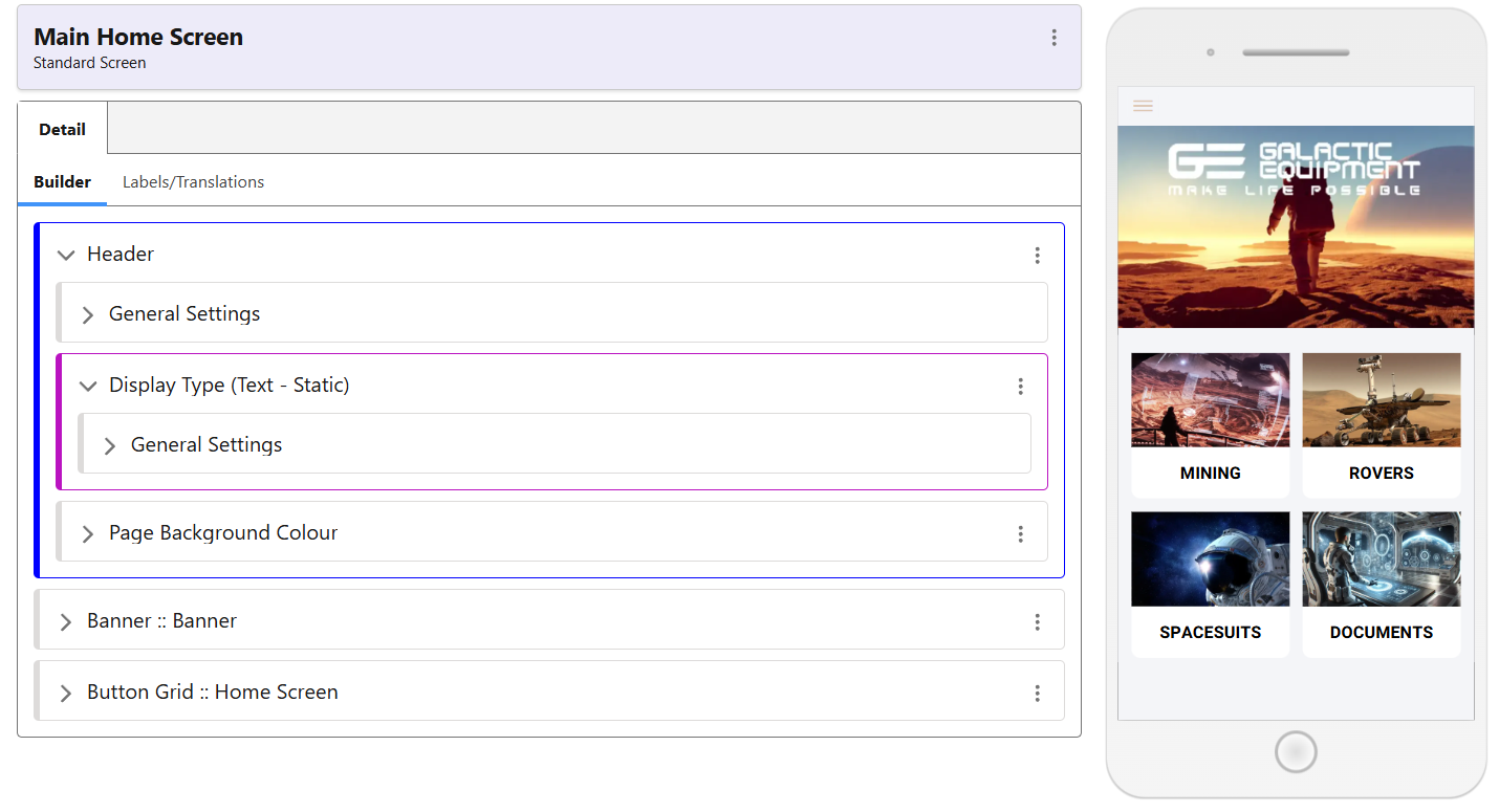
The App Header class controls several important elements. As seen here, you can choose to use Text for the header (or leave it blank, as in the screenshot below).
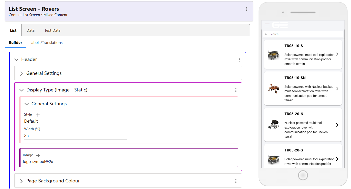
 The second screenshot shows how you are also able to use an image, such as your logo, to serve as your app header. This does not have to be consistent throughout, and can be set independently on each screen. As seen below, the Display Type is now Image – Static, instead of Text -Static, as in the first screenshot.
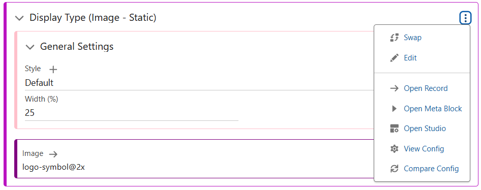
To make this change, use the menu of Display Type to select the Swap function. By default, this will be set to text. Swap to an image, and use the media explorer to select your image. You can then set the Width required as appropriate.
Styling Class
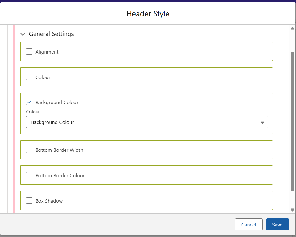
Inside the Header Style class are the following options. This is controlled from within the General Settings part of the Header. This class can be used to set the Colour of the header, either to blend in or contrast with your page background. It can also be used to size the header, making it larger or smaller as required. A default class is provided, which simply aligns the header colour with that of the page Background Colour.
Changing Background Colour
In a new Header, there will be no option for Page Background Colour before it is added. Without adding this element, the Page Colour will be controlled by the default styling elements.
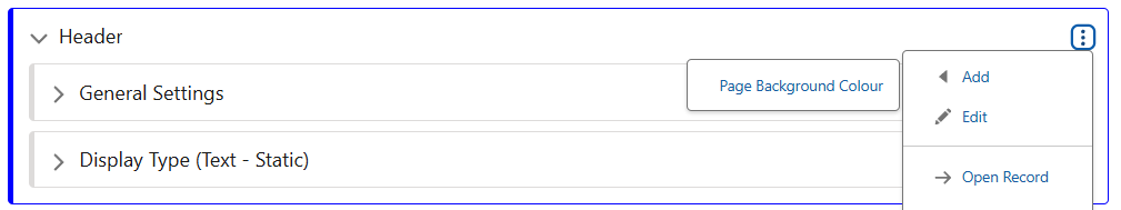
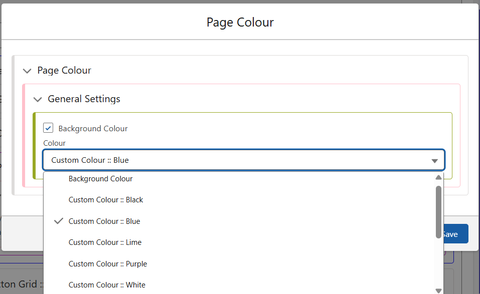
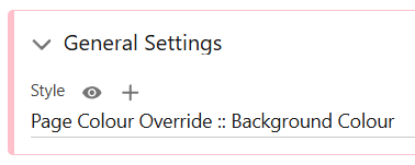
The page Background Colour is also controlled from within this Header section. Edit the Page Background Colour from its menu, and either select from the options available, or create a new class.
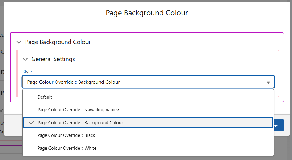
To create a new Background Colour class, use the ‘+’ arrow in the General Settings for Page Background Colour.
In the newly created class, you are able to select from the Custom Colours or defaults provided. If the colour you require is not available in this menu, then it must be added as a Custom Colour. The guide for this is here.