In this article
Banners
A new screen will always be blank, and often a Banner will be the first thing added. For this demo, we can add a Banner and style it to start building it out the page. Use the Screen Menu to add the Banner.
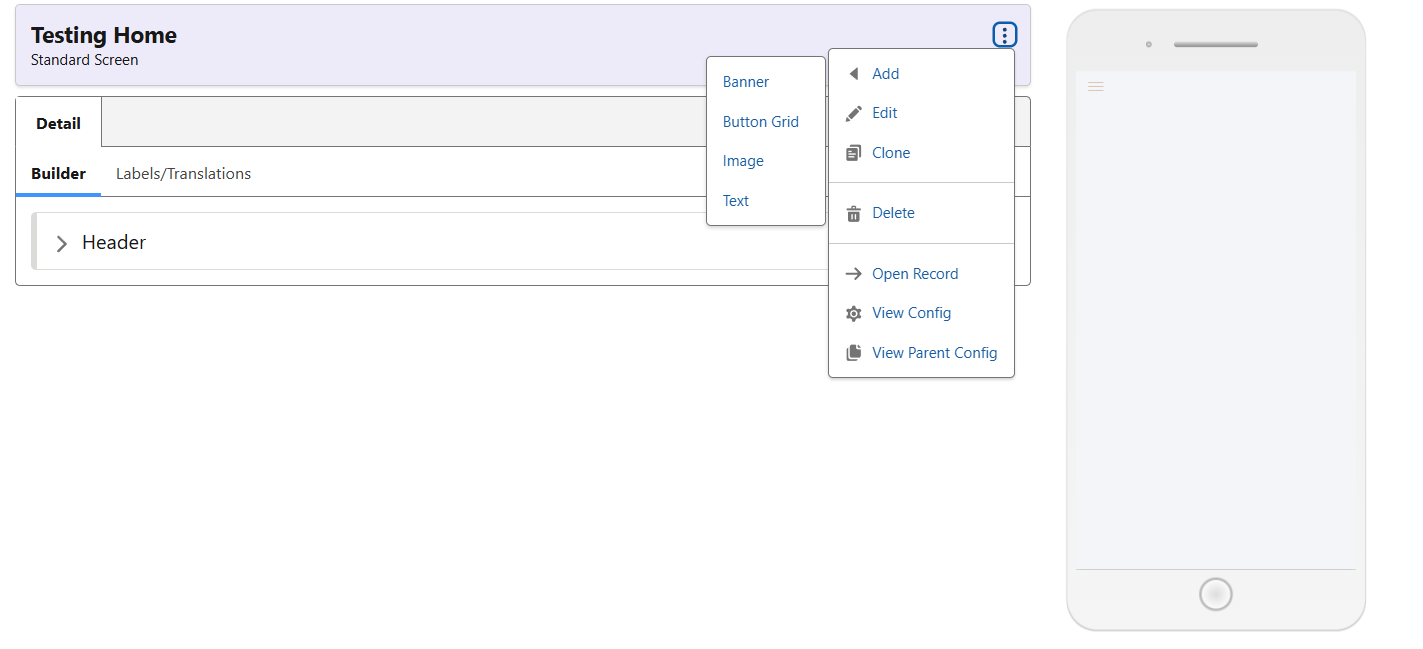
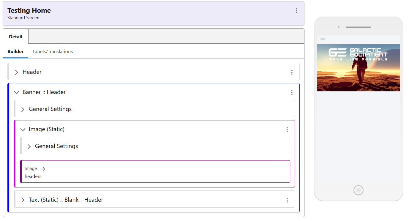
Once your Banner has been created, click the ‘Add Image’ button in its menu. From here, you can select from already uploaded images, or use the ‘Upload Media’ tab to do so on the fly. Pick an image, and if you are not using text, just edit and save the Text (Static) without changing anything. Finally, edit the top level Banner component, choose a name, and select the styling option most suitable to your needs. You can edit its properties afterwards if necessary – or create your own. Now your page should look like this:
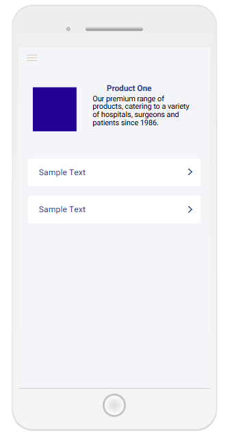
In other scenarios, a Banner may comprise both text and image, to serve as the header for a page or a product. Although just a sample screen, the following image should give you an idea of how this can be used in your app.
Banner Styling
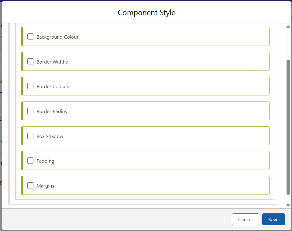
Available as default classes for Banner styling are those seen below. For the above Header, we are using the Full Width class, although margins and inset are also available.
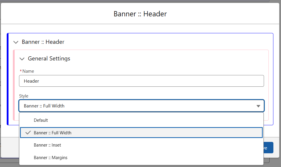
Inside the Style are the options you can see below. For the Full Width class, the margins and padding values are all set to 0px to ensure there is no spacing around the image. Similar options are available for the Wrapper, depending on where the styling is required.